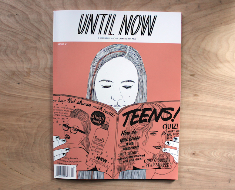
Have ya’ll heard of Until Now? If not, then you’re in for a treat. It’s a publication started by illustrator/art director Alex Citrin and features stories about coming of age (AKA the transition from childhood to adulthood). Personally, I love these types of tales — they are by far my favorite subject to consume. So, needless to say that when I heard Alex was producing this for her graduate thesis, I was excited.
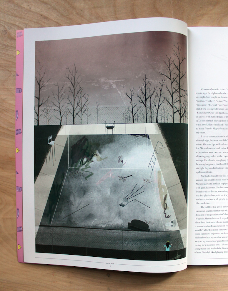
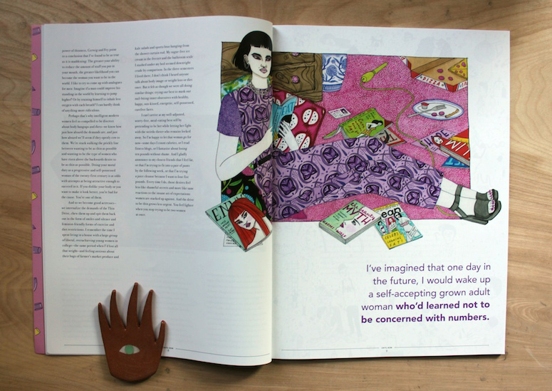
Alex was a cohort of mine in MICA’s MFA Illustration Practice program, where we’re encouraged to think about illustration differently and push the field to new places. As a result, the first issue of Until Now features a ton of great illustration showcased in gorgeous, large spreads.
I had the pleasure of interviewing her about being an art director and her love of coming of age tales. This is a long-form interview, but stick with it. Alex is hilarious and has some great things to say.
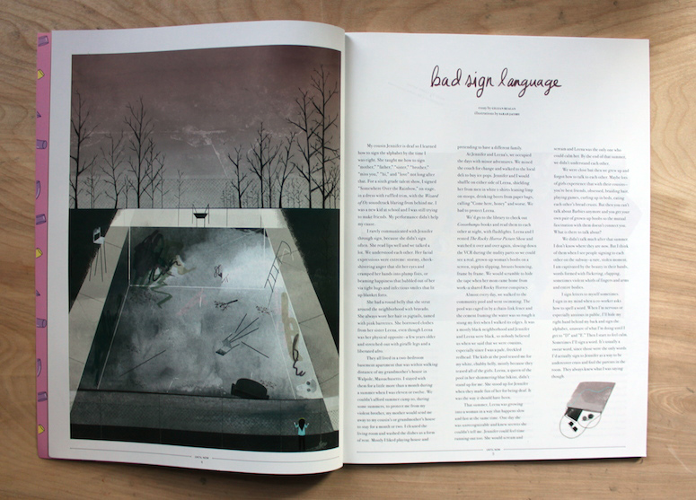
So, I’ll spare you answering a lot of questions that you’ve already covered, but for those that aren’t familiar with Until Now, how would you describe it? How long had you been thinking about putting a publication like this together?
Until Now is a magazine about coming of age, although I envision the readership to be broader than just those currently coming of age themselves. I suppose I’d been thinking about producing a collection of stories related to this topic for a while, though in different forms — collages, photo essays, a graphic novel…those ideas were reflective of my focuses at the time (a college art major, band photographer, and illustrator, respectively).
I’ve always been obsessed with documentation and I am also a believer in the traditional print magazine as a medium for communication as well as a kind of art object. Basically, I’m a complete luddite. Considering the vast cultural reach of your average mainstream magazine, though, there’s still something not quite serious about the format. I think there’s room to play with that contradiction. Similarly, coming of age stories are typically relegated to the “less serious” YA section of the library or within magazines aimed exclusively at teens. I’m still fascinated by coming of age stories at age 27.
I am someone who LOVES coming-of-aged themed things, so I was really enthralled by the whole thing. I think my fascination comes from being a “nerd” in high school (no parties, no late curfews, no nothing!), and by absorbing these stories I make up for lost time. What draws you to this particular genre, and what keeps you coming back for more?
It’s not just me! I was also a nerd in high school, although perhaps I fell more off the grid socially because I was very quiet and the minute my parents began allowing me to take the train into New York City by myself (I grew up in suburban Connecticut) my interest in the social goings ons of my peers basically evaporated. In retrospect, I think this gave me a chance to be an impartial observer more than anything. Even when I would go to these matinee hardcore shows on my solo trips into the city, I still took on the role of observer, as I never quite fit in there either. I think my overall interest in the topic is a combination of having spent so much time just watching other people as a teenager, plus never finding a real sense of belonging at that age. I’m biased, but I feel like there’s something a bit sinister about people who felt they really belonged anywhere at that age.
I also relate to your concept of compensating for “lost time”, which I feel plays a part in why some adults do become drawn to this topic — it’s not a matter of wanting to relive it, but to view these always vaguely familiar stories through wiser eyes, gain some kind of understanding whether or not we experienced the specific events of the story itself. Growing up is not a particularly life affirming experience as it’s happening, but in reevaluating those times after the fact there is a sense of accomplishment mixed with a little sadness, maybe. Nostalgia, in a word, plays a pretty huge part.
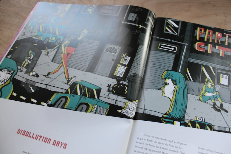
What are some of your favorite coming-of-age stories (written, spoken, books, movies, etc.)?
Certain coming of age movies in particular have really stuck with me, but they change slightly with each viewing — I think that sensation is indicative of the genre in general. Trust, which is one of Hal Hartley’s early films, is one I come back to a lot. It’s filled with a lot of strangeness and dark humor centering around a suburban Long Island teenager who becomes pregnant and starts hanging out with a young genius social pariah who always carries a grenade around with him. They wander around being outcasts together, she wears a letterman jacket, he wears a trench coat. Outcasts banding together is a pretty classic trope in coming of age films, and despite it’s idiosyncratic characters I always felt this movie captured that sensation best.
On the other end of the spectrum, I consider Can’t Hardly Wait a completely amazing un-ironic classic as far as coming of age movies are concerned. I don’t care that everyone is a teenager being played by a 30 year old, there’s something hugely magnetic about it. It’s not reality and it’s not supposed to be, it’s like a retelling of a high school party by someone who has only read the textbook definition of what an American high school is like, which makes it kind of fantastical and awesome in its own way. The nerd who becomes a rock star for a night? The childhood best friends in different cliques who lose their virginities to each other? I love it.
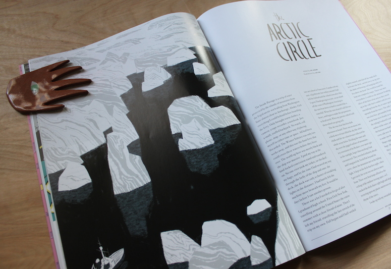
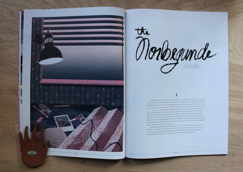
Was Until Now your first time in an art directing role? How did you decide on what illustrators and writers to hire? Which was easier to work with — pictures or text?
Until Now was technically my first time in an art directing role, yes. As for hiring, I really let my personal taste dictate the content, although I was wary of bringing on artists with too-similar styles to one another. For the first issue I definitely called in a few favors; I’m lucky enough to have some incredibly gifted writer and illustrator friends, all of whom I reached out to. I’d say I knew about a third of the contributors for issue one in person, the other two thirds came from the ether, which is to say, artists and writers whose work I’d been following or had recently become aware of.
I was a bit more broad with my requirements for the writers, the only real consideration I took was that they all be practicing professional writers; being familiar with the typical day to day of an illustrator, being one myself, I figured I’d feel comfortable hiring and working with them immediately, and for the most part I did. But writers are a different thing entirely. I’ve had some writing published myself, but I don’t consider it a professional practice. It was fascinating, though, to work with these writers and edit for them as well. That said, I gave the writers fairly free reign, as it was all personal stories (save for a lovely piece of fiction and two poems), and I felt that a fairly hands-off approach was crucial to the integrity of the magazine. The illustrators had it a bit tougher, since I’m stretching my new baby art director legs. Being able to work with illustrators who I think are hugely talented, some of whom I believe will eventually make a serious impact in the field, was humbling.
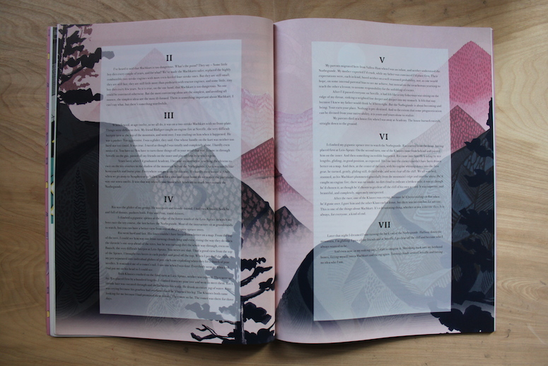
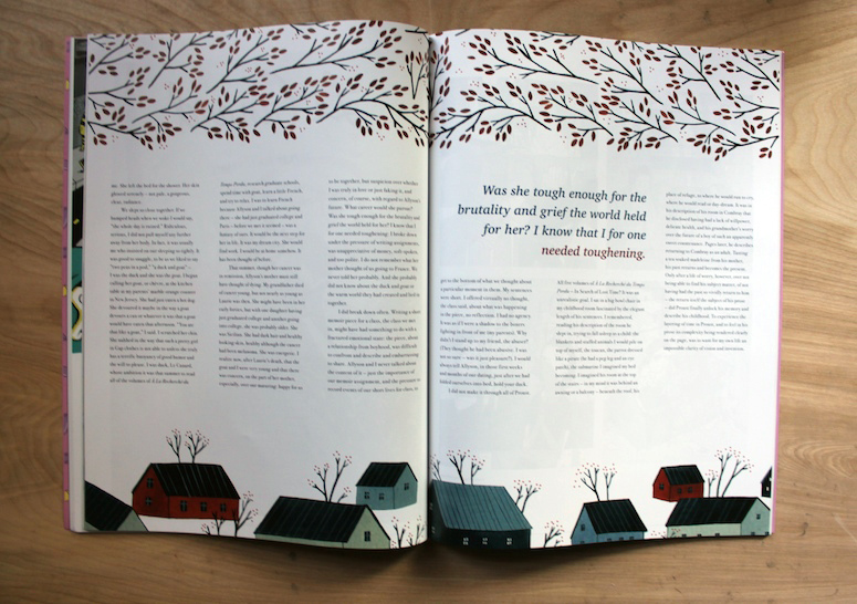
There’s a lot of experimenting in this publication, especially in terms of the different layouts. I like it because it seems to give each piece its own special voice and doesn’t feel cookie cutter. Was this a conscious choice? And, if so, one you think that you’ll continue?
Thank you! And yes, this was a conscious choice — I wanted to keep the design as clean as possible to really let the illustration shine. I’ll be the first to admit, illustration is tough to work with in a way that does not compete with flashy, cool-kid design. Those two things do not always live well together. It was definitely a challenge to design a magazine that respected that boundary without being boring. Because I was in graduate school at the time, I also had a whole gang of diverse, highly attuned illustrators and designers willing to give me feedback, which was a giant blessing. I definitely plan to continue on in this vein, but since then I’ve also started working as a designer at a large weekly magazine in New York; everyone in the art department there has taught me so much more about publication design and art direction than I knew when I started Until Now, the kind of things you can only learn from experience.
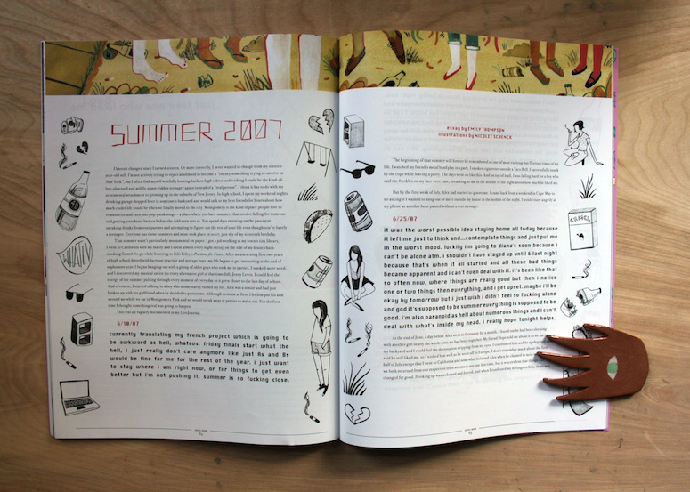
What’s your favorite part of this issue?
I feel connected to all of the content in the magazine! I will say that some of my favorite illustrations were the ones that I knew challenged the illustrator, when he or she said “hmm ok well I haven’t done that before really but let’s try!” Lisa Perrin was one of those people, and she came up with some hilarious illustrations in her trademark gorgeous style. Sarah Jacoby, who actually illustrated two of the essays, including one fiction piece, really pushed herself out of her comfort zone for some of those illustrations, which dealt with imagery she doesn’t typically incorporate in her work. She nailed it, though.
It was a huge deal for me personally to work with Greg Kletsel, Rand Renfrow, and Laura Callaghan, all three of whose work I’d admired from afar and was very excited to have them on board. I was also blown away by Dave Singley — if we have to use labels, he qualifies more as a “fine artist” than a traditional editorial illustrator, but to me images are images. He told the story at hand while simultaneously projecting a kind of sensual, moody, ever so slightly silly vibe to the essay it illustrated, which was perfect.
To be perfectly honest, though, I did not run one word or one image in Until Now that I didn’t personally love, that I wouldn’t defend if need be.
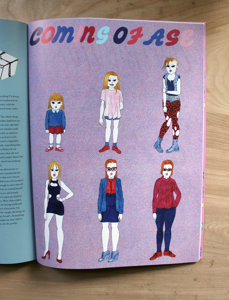
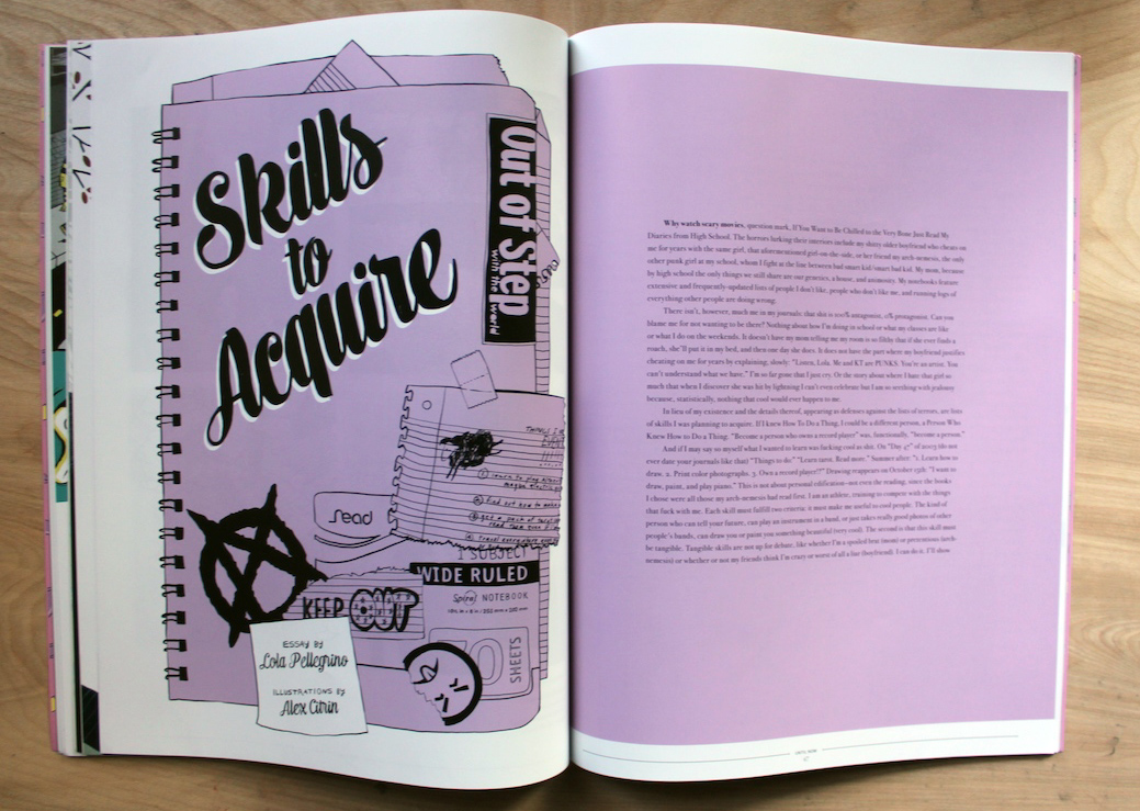
Finally, you mentioned that issue #2 is in the works. When is that slated for release (or even speculative at this point)? What things are you going to keep the same, and what do you think you’ll change?
Issue #2! This one is going to be a little different, but really just a natural evolution from the first, which incorporates both the things I’ve learned from the first issue as well as not being tethered to certain deadlines and written evaluations that come with having produced Issue #1 as my graduate thesis (although those restrictions were, admittedly, mild to say the least). The latter means I’m planning to incorporate a little photography into the next issue. My taste in photography is much narrower than my taste in illustration, so while I’m excited at the prospect of including photography this time around, Until Now will remain a predominantly illustration-heavy publication.
I’m considering expanding into feature and interview territory, so I may end up looking into doing interviews should it become appropriate. I’m still deciding. I’ll also be producing Issue #2 under a sub-category this time around; while the first issue was general stories about coming of age, #2 will be stories about coming of age in regards to a certain topic. I’m calling this one Until Now: Spaces + Places, with the content centered around those particular places that really meant something to you as you were growing up — a bedroom, a car, a field, a basement, a classroom…I still feel that this could go anywhere! I’m very excited about seeing where it goes, and I’m planning to release it in March 2015.
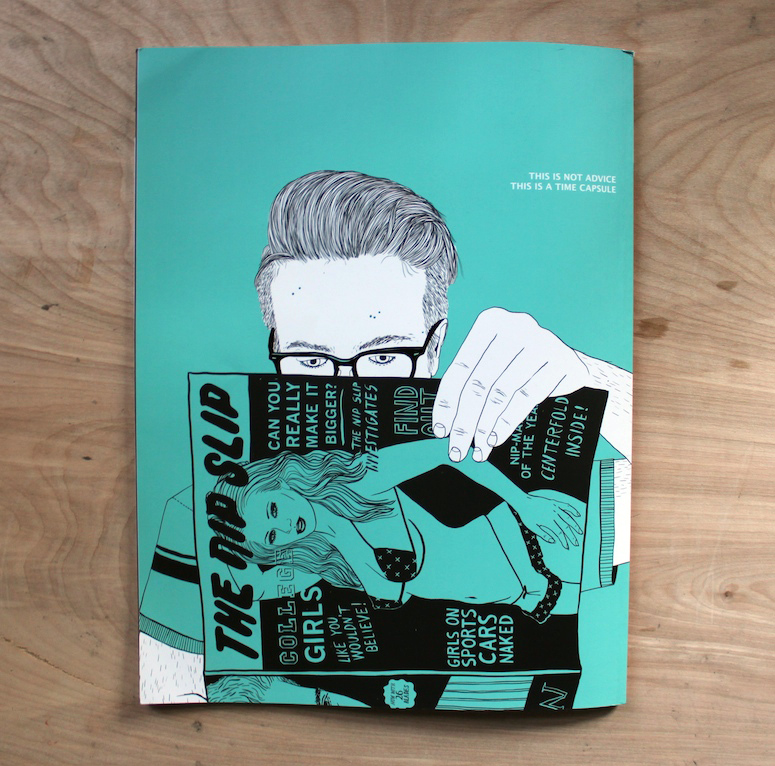
Thanks, Alex! You can find Until Now in these places.

