Last Friday, I attended the opening of the MFA Illustration Practice thesis exhibition at the Maryland Institute College of Art (MICA). As an alum of the program, I’m always fascinated to see how the thesis projects turn out. These are massive endeavors that take a whole school-year of work (your second year is dedicated to them), and even longer to plan. To say they’re involved is an understatement.
I had the pleasure of, in February, being a guest critic for the current thesis students, so I was extra curious (and excited!) to see how their projects panned out. And I was not disappointed—the installations were at times beautiful, thought provoking, and poignant. They represented a unique points of view. And, in keeping with the intent of the program, they help to redefine and push the field of illustration in new ways.
From slot machines to giant maps to never-ending dreams, here’s a peek into look at the 2017 Illustration Practice thesis exhibition. (It’s not everyone in the program.) If you’re local to Baltimore, it’s up until Sunday, April 9 in MICA Lazarus Center—Riggs and Leidy Galleries. Go look at the show then get pizza at Joe Squared. You won’t be disappointed with either.
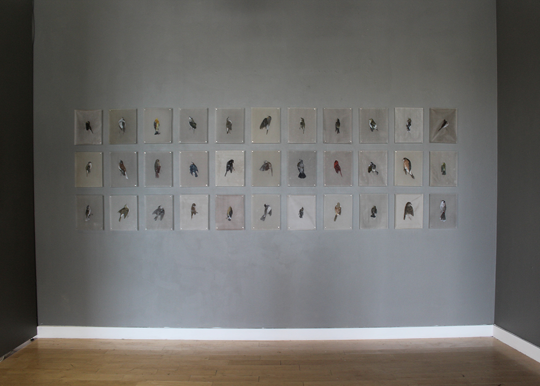
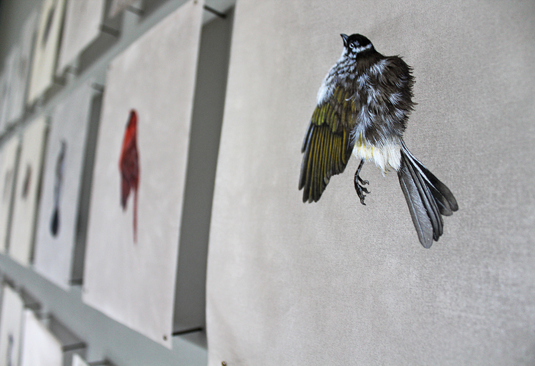
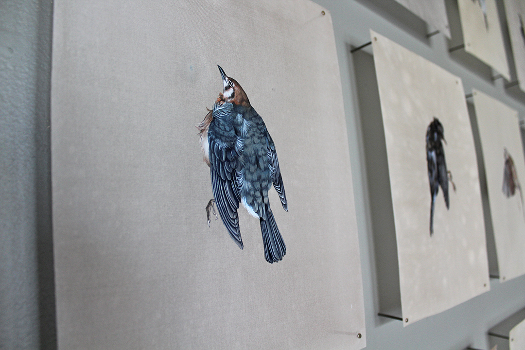
When you first walk into the space, Jieyu Zhang’s installation is one of the first that you see. Her space, which represented the most traditional fine art approach, was poignant. The beautiful, intricately detailed paintings of birds on silk showcased birds who had died because of running into windows and other human interaction.
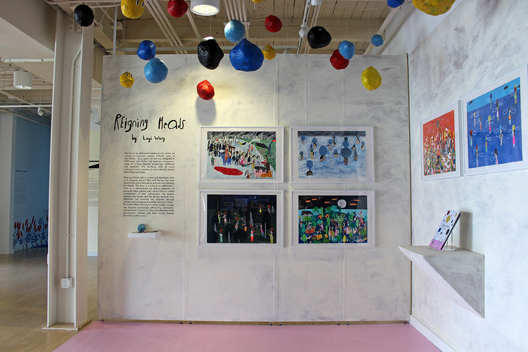
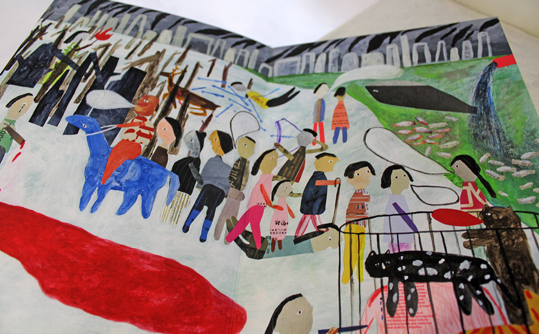
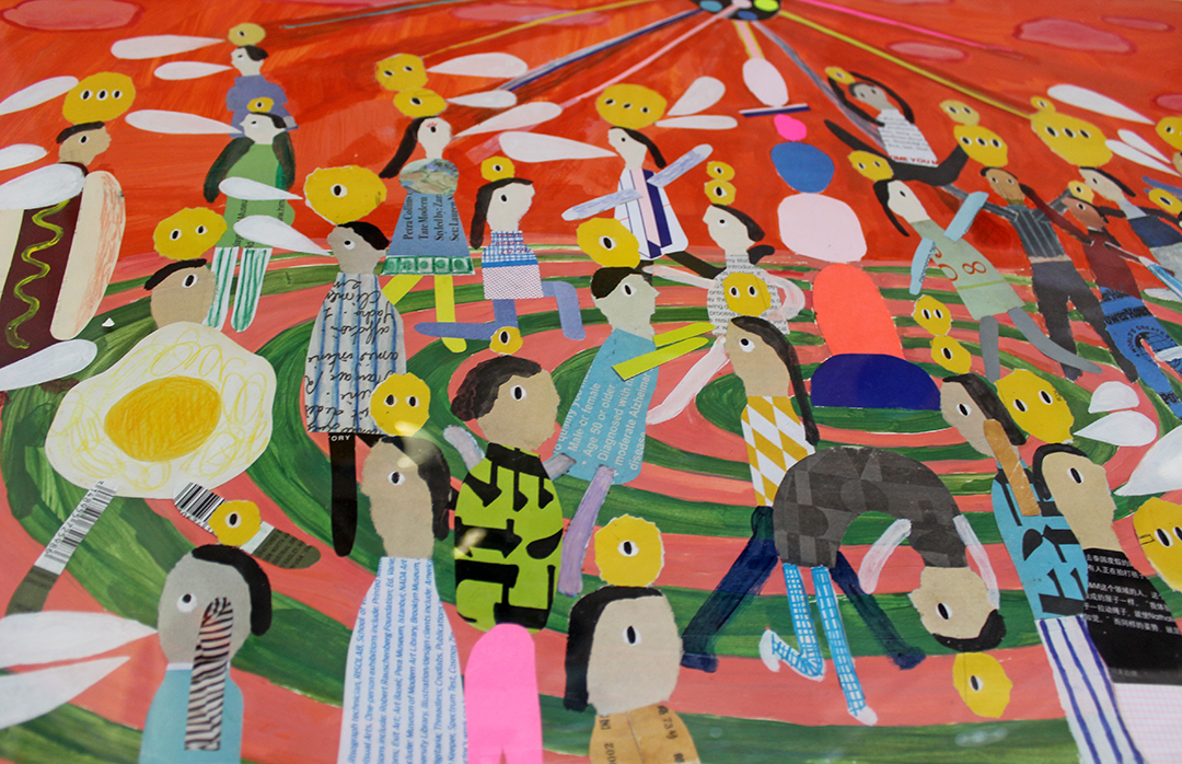
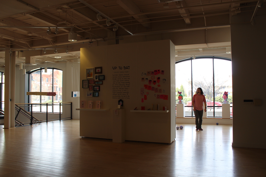
Just beyond Jieyu’s installation is Luyi Wang’s Reigning Heads. Her thesis, which took the form of a picture book, imagines what happens to a dystopian society when they are completely selfish. (Sound familiar?) The colorful, abstract images are charming, yes—but don’t let that fool you. From them comes the message, “Don’t be another cynic!”
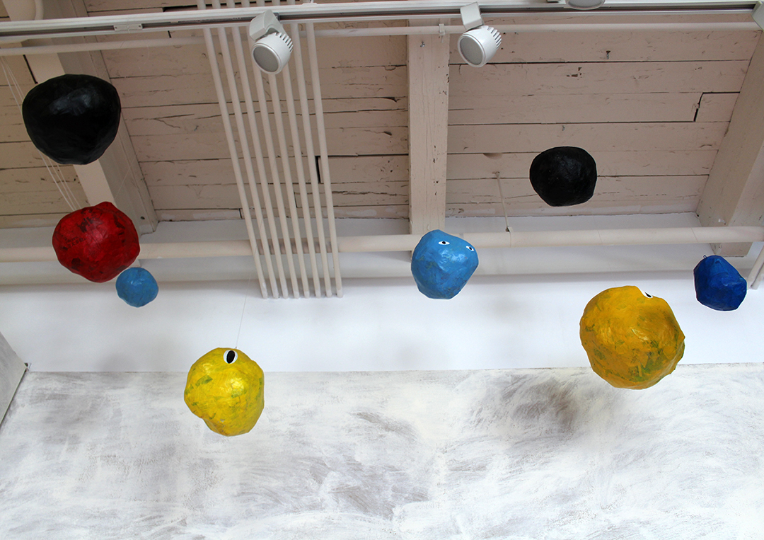
I enjoyed seeing Luyi’s collage originals as well as the addition of papier-mâché heads that were “raining” from the ceiling. She actually had a couple for sale that night and I bought one. It’s at home among my plants.
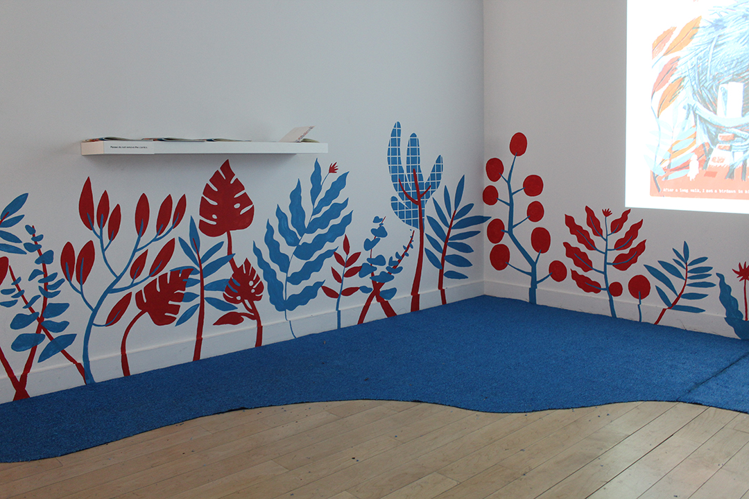
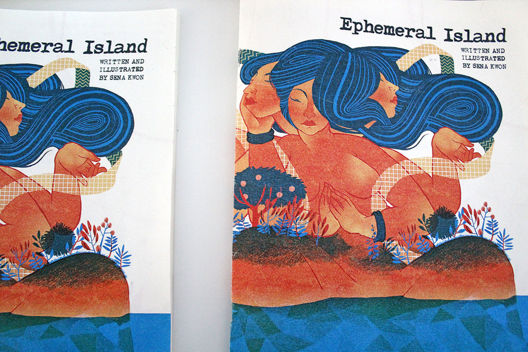
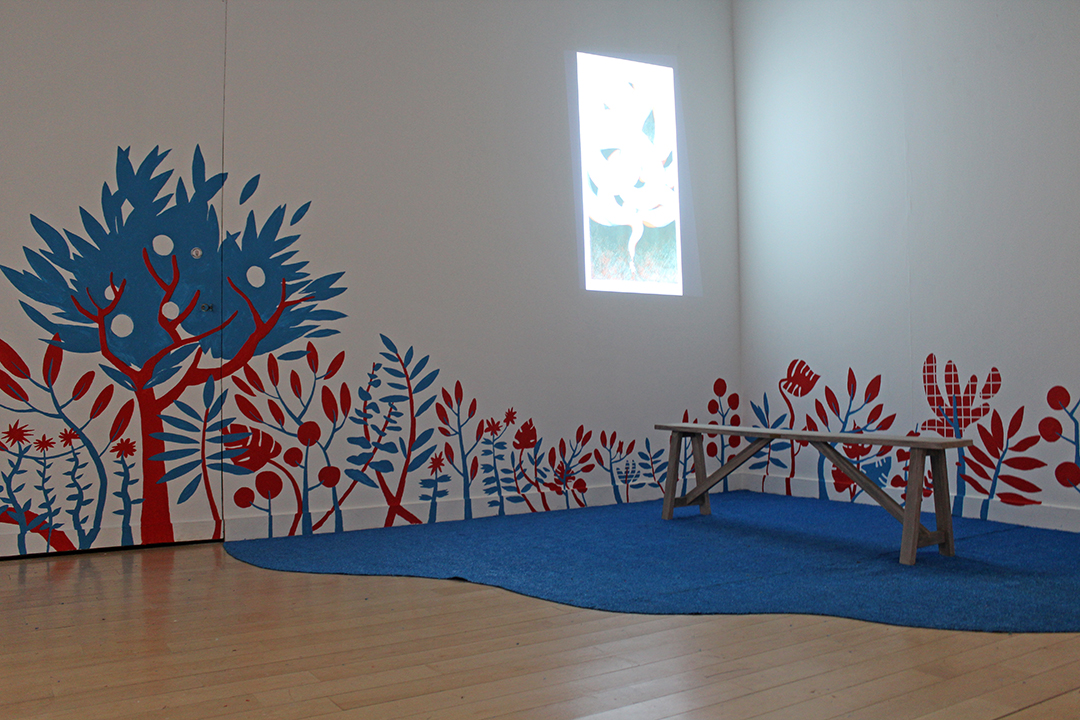
There’s one room in the gallery that’s made for animation. Windowless and dark, it’s the perfect place to display moving pictures. During my thesis year, the Jun Cen debuted his fantastic Mutual Tunnels. Sena Kwon used the space for two animations. One featured sequential illustrations with animated elements. The other was of a silhouetted girl who contends with a giant cloud/snake-like creature.
The presentation—particularly the murals on the wall and blue carpeting—was a welcome addition. Sena’s beautiful florals complement her project called Ephemeral Island, which takes the form of a physical book. Through it, a girl, Doma, “explores the idea of faith through various interactions with mythical beings” and learns how to respect the heritage of other cultures and what they believe.
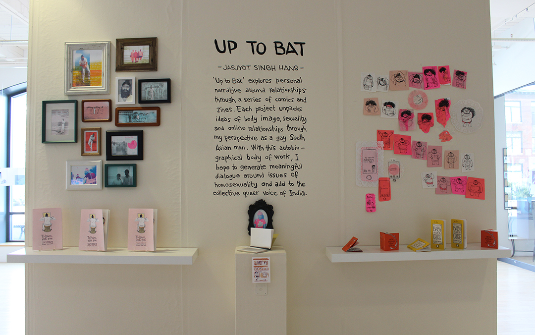
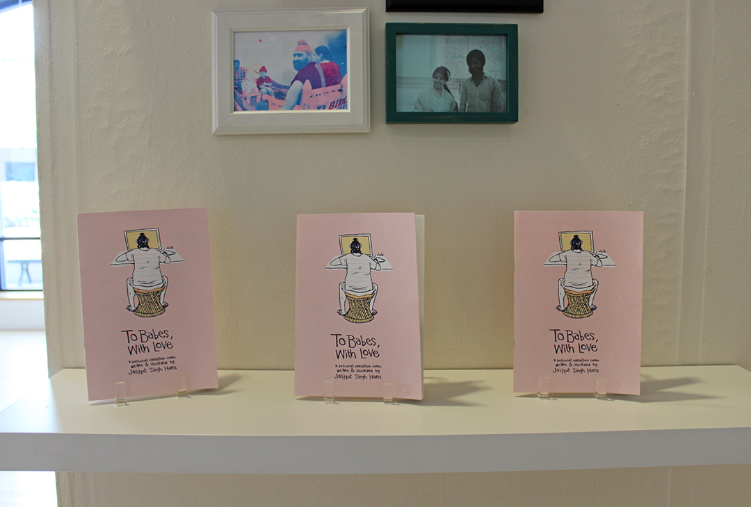
In the middle of the gallery is Jasjyot Singh Hans. He created a series of zines that depicted his experiences as a gay South Asian man. The sequential works have a powerful voice. I’ve met Jasjyot in passing but never had the chance to have a conversation with him. Despite this, I feel like I already know him after these books, which deal with body image and online relationships, among other things.

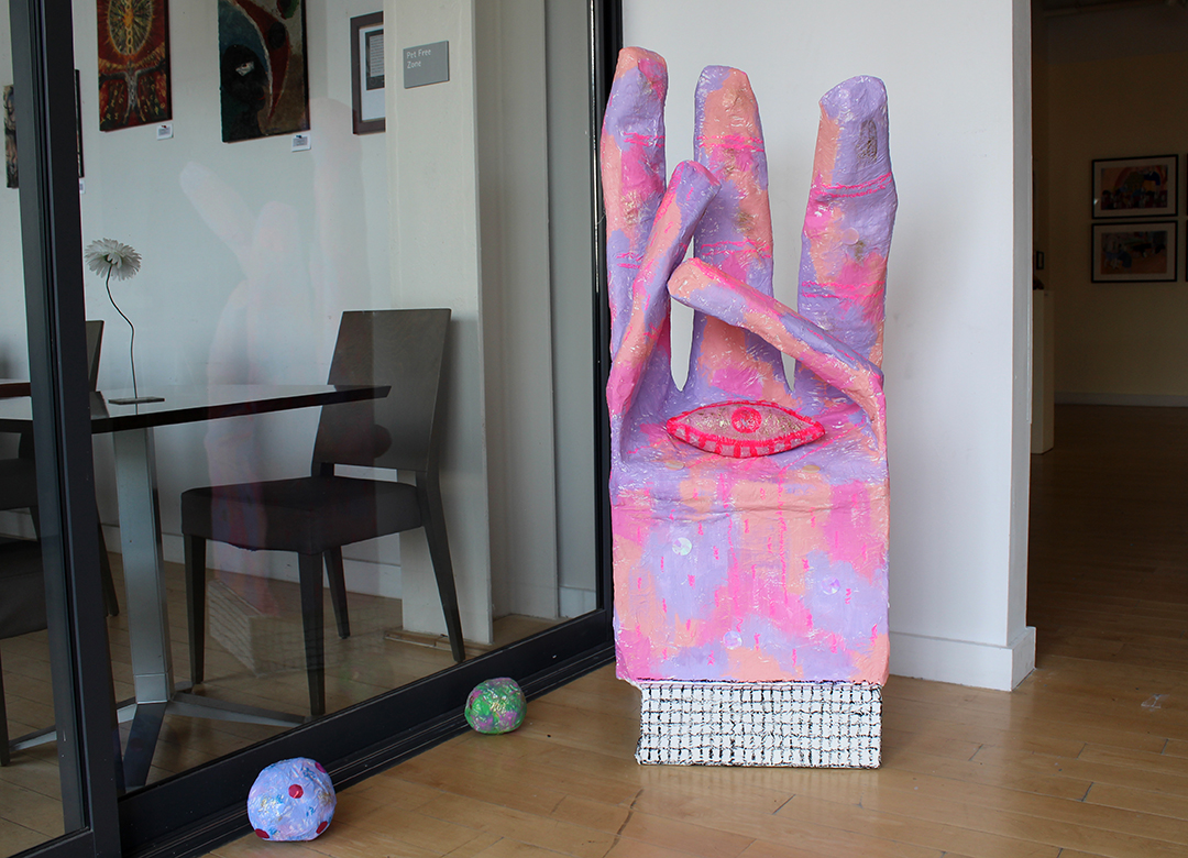
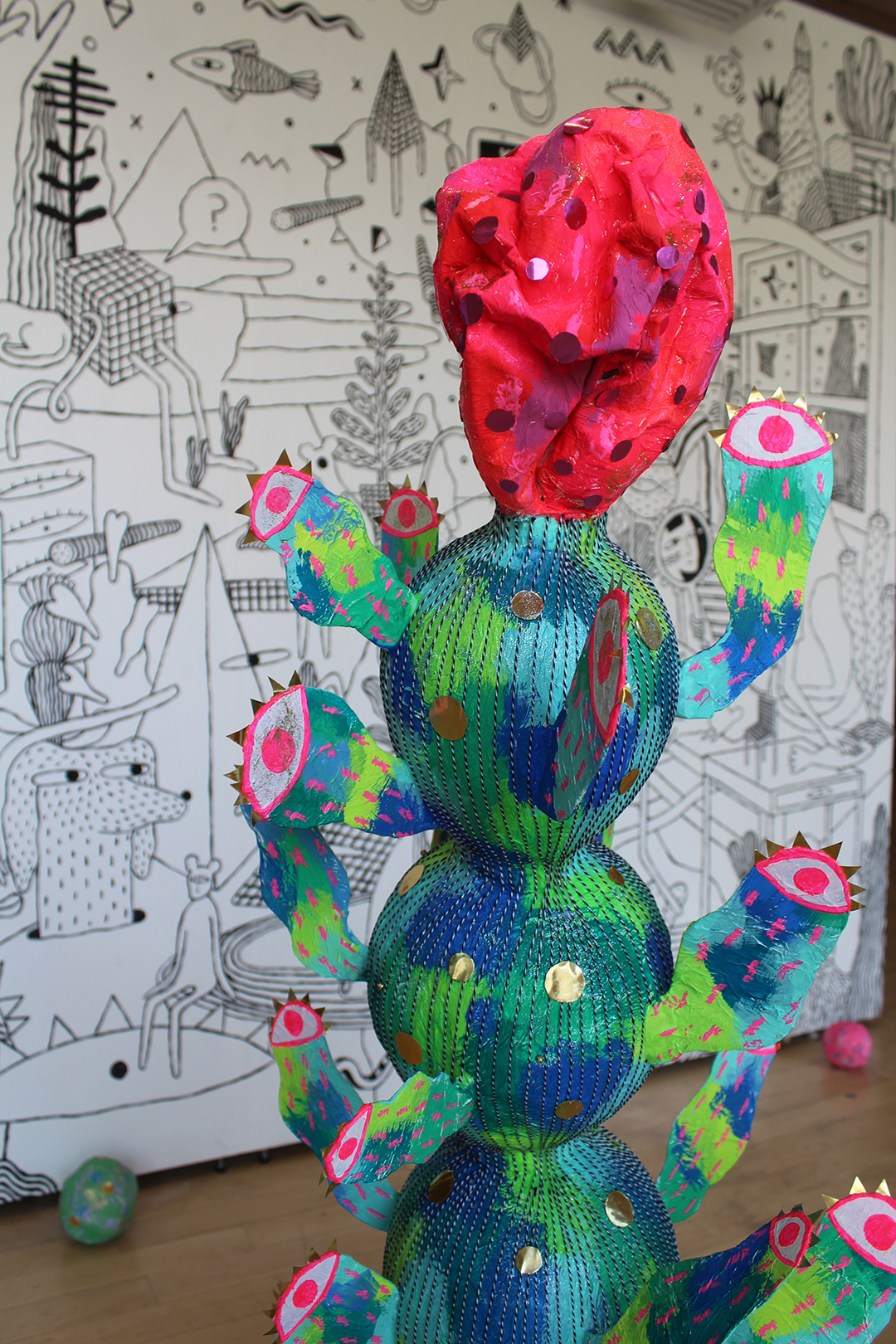

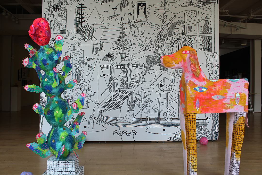
Aditi Damle welcomes you to her brain through life-sized papier-mâché sculptures, a giant wall mural, and bevy of ceramics. They’re strange, yes, but also colorful and inviting. You walk between the strange creatures and get to know her world—it seems like a delightfully wacky place to be.
Aptly called Say Hello to My Brain, Aditi’s project is where she asks questions like “Who am I?” and “Who are you to me?” and the most importantly, “Would you like to hug my dog?”
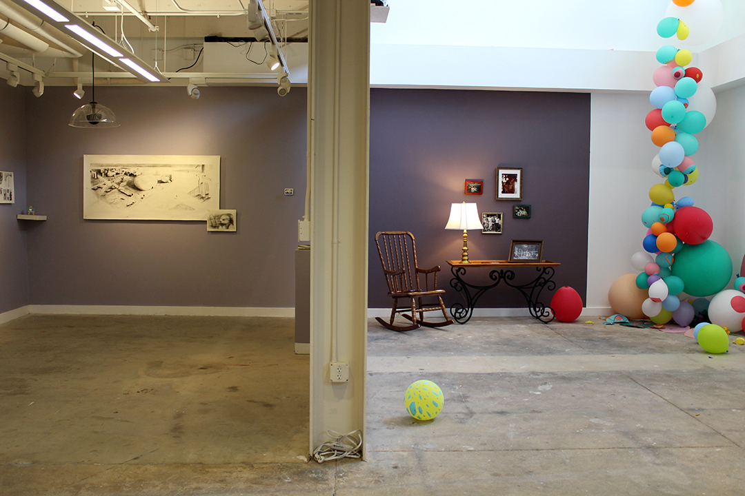
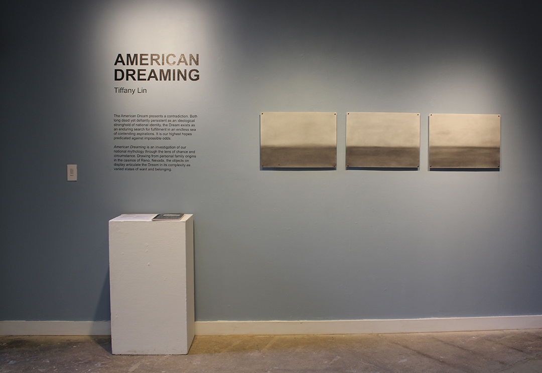
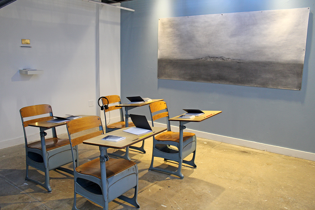
Walk down the stairs from Aditi’s installation, and you’ll see four more projects. One is Tiffany Lin, who explores the American Dream in a relatively minimalist setting. Arranged like a classroom—and complete with school desks—she presents her thesis, American Dreaming. Tiffany writes, “American Dreaming is an investigation of our national mythology through the lens and chances of circumstance. Drawing from personal family origins in the casinos of Reno, Nevada, the objects on display articulate the Dream in its complexity as varied states of want and belonging.”
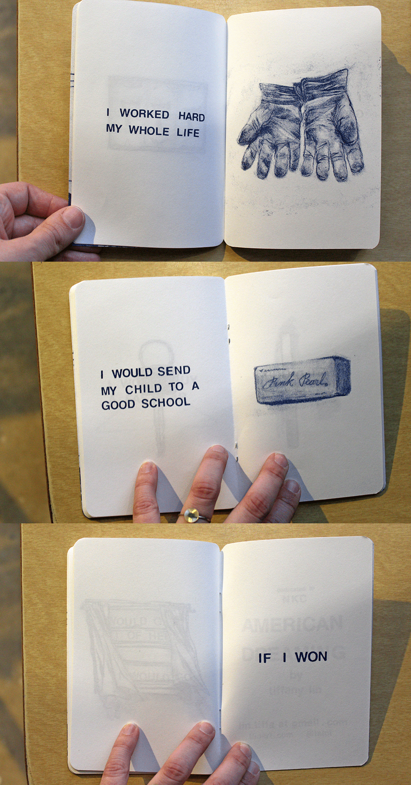
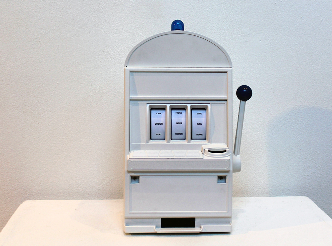
Elements of this are woven throughout her exhibition, from the interactive slot machine that spits out random three-worded axioms to a small illustrated book about winning the lottery. The book (seen here as an animated GIF) was my favorite part of American Dreaming. It was about what people would do with their lottery winnings. Some were extravagant, like buying a fast car, but others were more practical, such as sending your kid to a good school. Your chances of winning the lottery are very very very small, but people still find hope in it. (Sounds similar to the American Dream.)
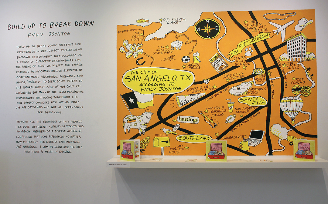
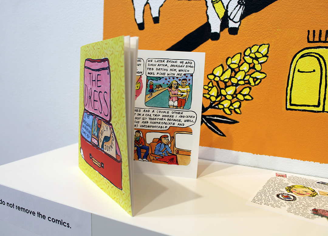
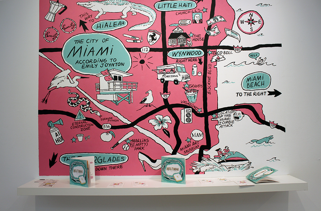
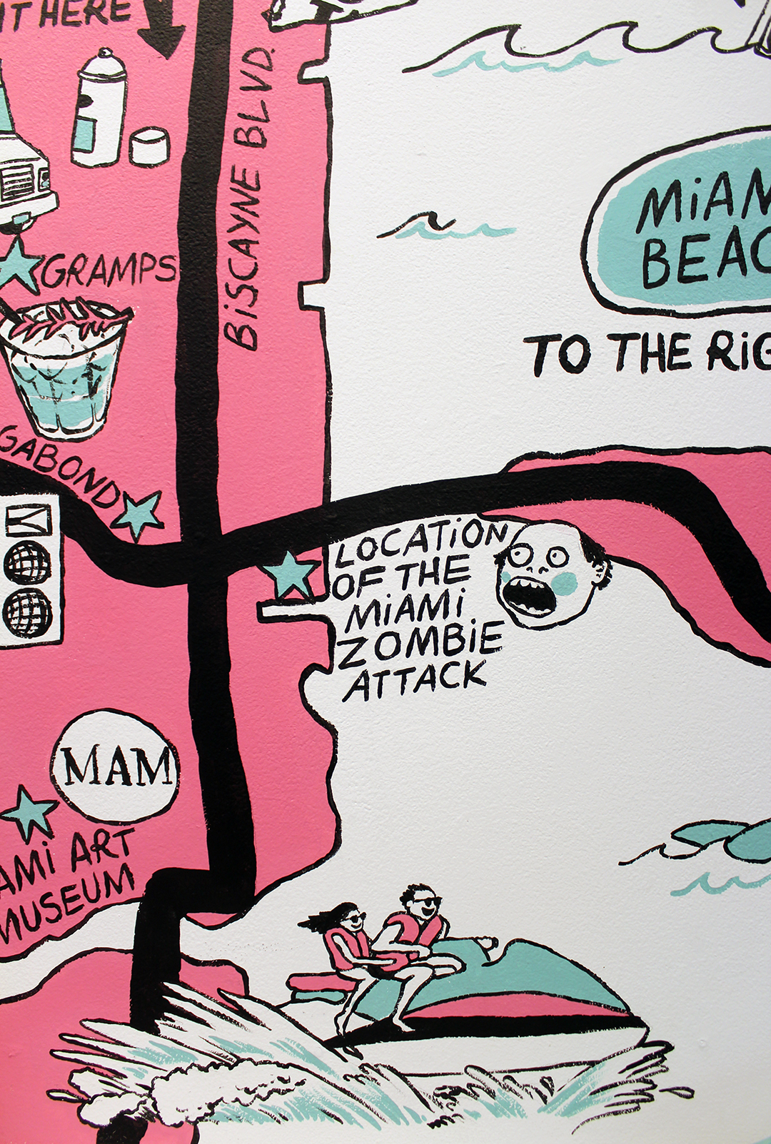
Just down the hall from where I first arrived was Emily Joyton’s colorful maps lining the wall. They’re supplements to her year-long comics called The Dress and Whitman, which tell the story of “life experiences in retrospect.” Specifically, they take place in San Angelo, Texas and Miami, Florida, where grew up and lived for a number of years, respectively.
The comics have an attitude that sums up what I love about autobiographical sequential work. “This project considers how not all buildups are satisfying and not all breakdowns are descriptive.” Continuing, “Through all the elements of this project I explore different avenues of storytelling to reach members of a diverse audience, confirming that some experiences, no matter how different the lives of each individual, are universal.”
I left thinking, among other things: I gotta get into papier-mâché!
