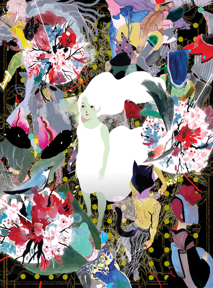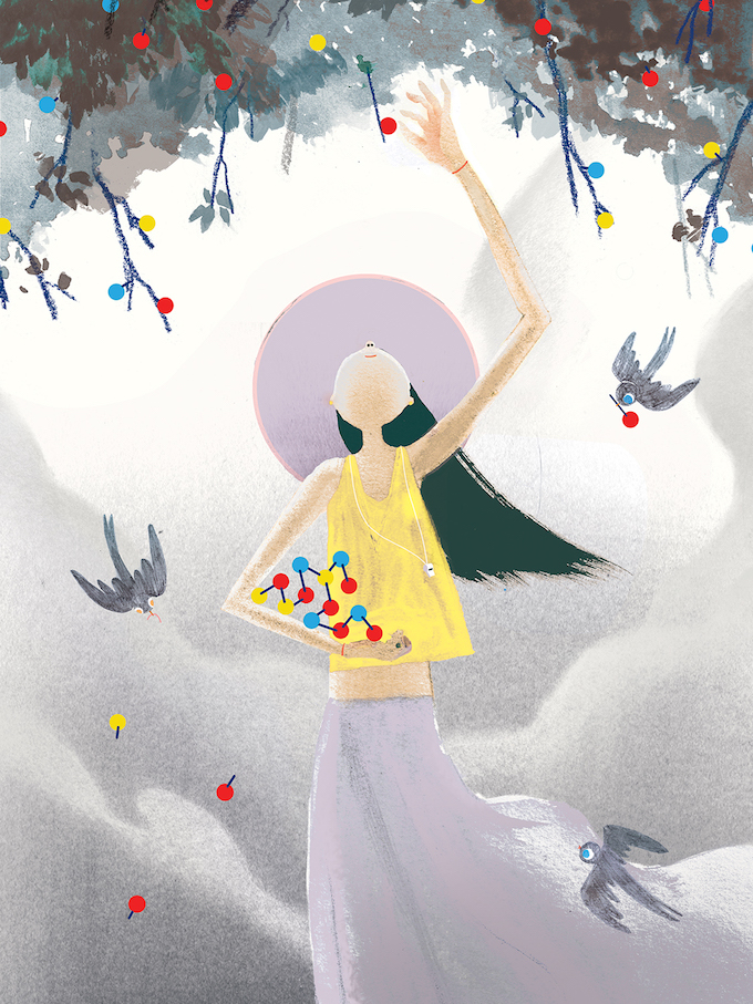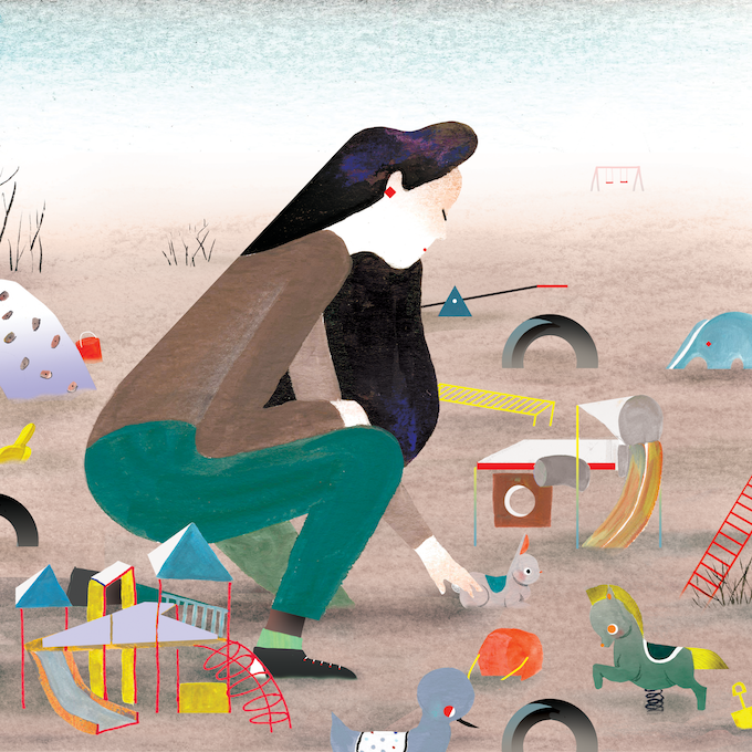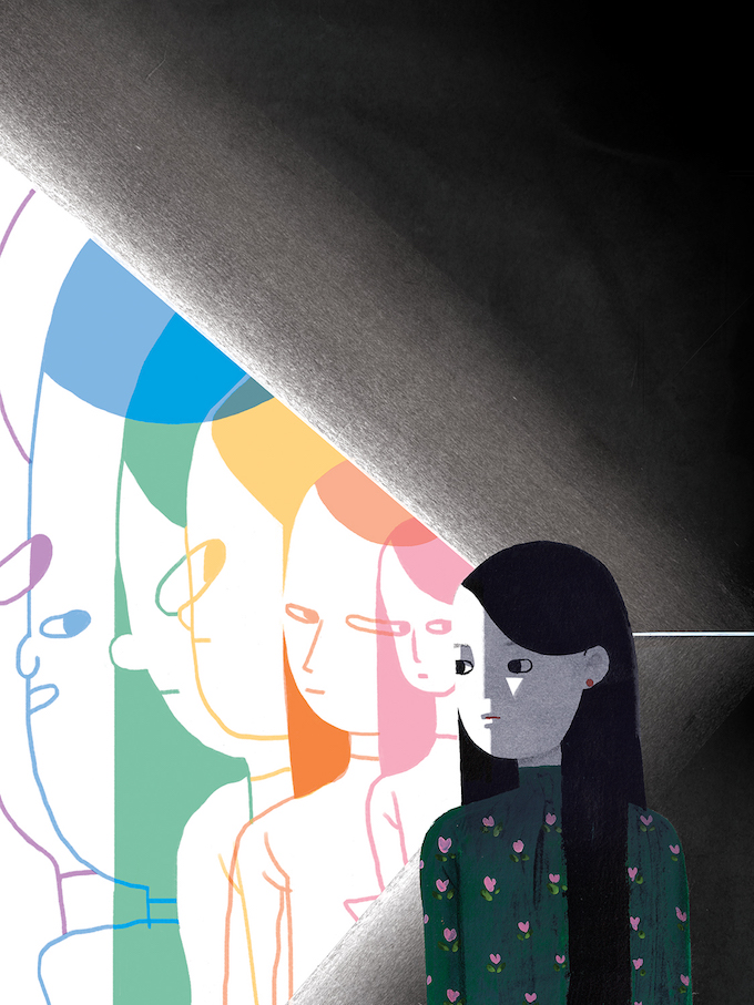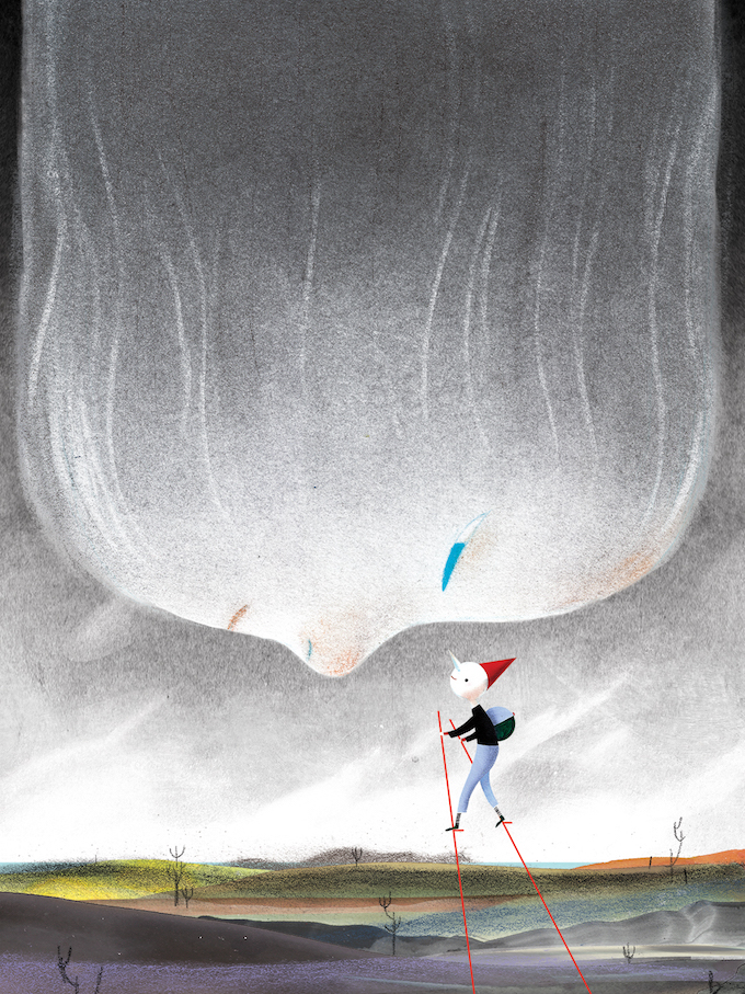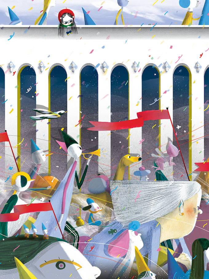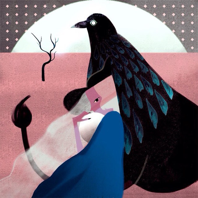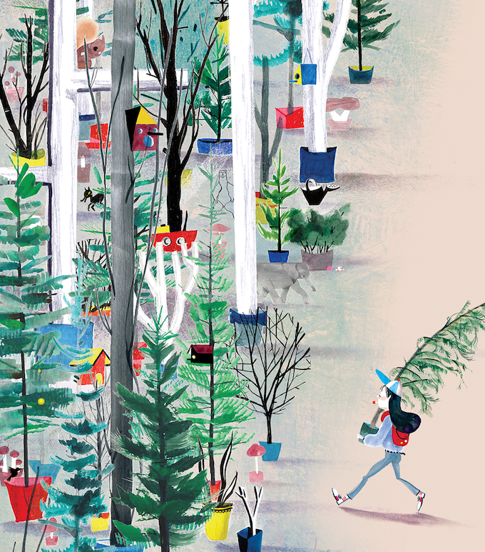
Canadian illustrator Linda Yan fuses strokes of color into vibrant compositions. She mixes and matches abstracted red, blues, greens, and yellows shapes, creating a collision of textures that are offset by areas of solid color. This produces a visual “push and pull” effect and helps achieve visual balance so that our eye isn’t completely overwhelmed.
I found Linda’s work in issue 27 of Uppercase magazine, which showcases 30 new illustration talents. As with all issues, this one is beautifully designed, but if you’re a fan of the field, you’ve got to check this one out!
