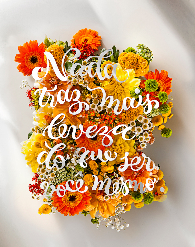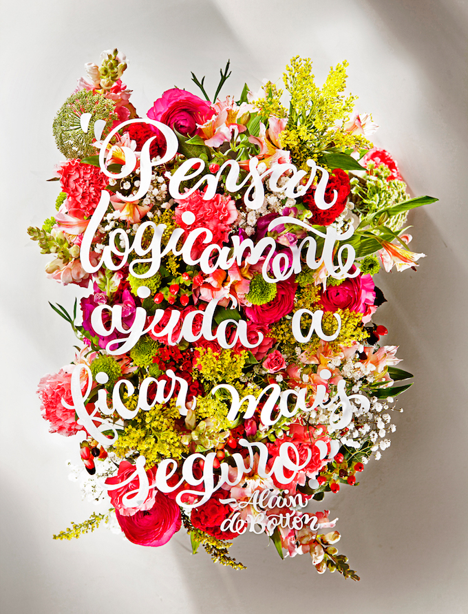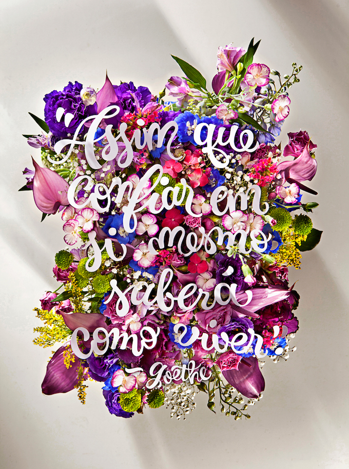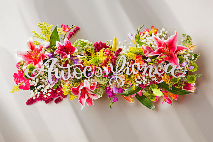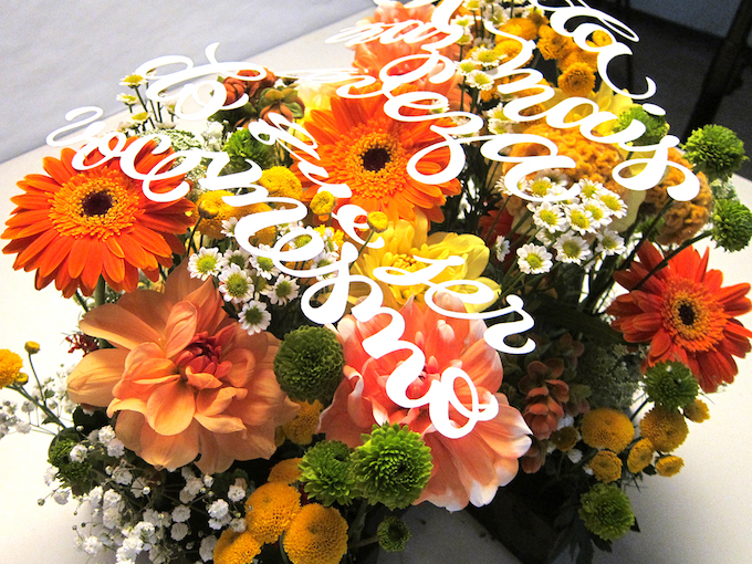
I’m not shy about my love of florals. Typically, they’re shown here as drawn or embroidered, but these spreads for Bons Fluidos Magazine are beautiful and special… so of course I wanted to share!
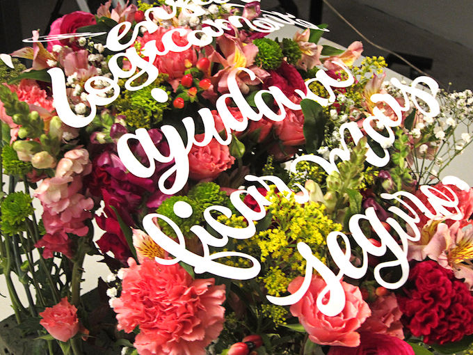
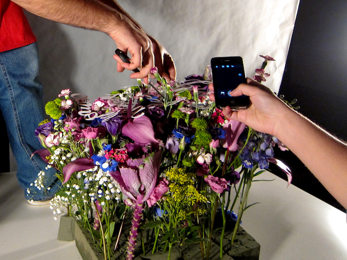
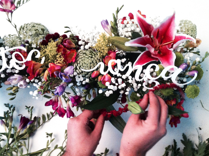
To produce the project, a team of creatives—Fernanda Didini, Rodolfo França, Marina Chaccur, Alex Silva, and Andréa Silva—hand-assembled colorful bouquets and then stuck cut paper lettering among them. Then, they were photographed straight-on to create a flattened, knockout effect.
When I think of typography pieces like these, I just assume they’re produced digitally—like so many things these days—but it’s nice to see that an analog approach was taken. They appear polished but contain certain nuances that could’ve only been done by hand.
