Two Fridays ago, I had the pleasure of attending the MFA Illustration Practice (MFA ILP) Thesis Exhibition at Maryland Institute College of Art (MICA). I was really excited to see the show, as I graduated from the program in 2013 (the first class!) and wasn’t as familiar with this year’s work. They didn’t disappoint! I was really impressed with everything I saw, and I admire how they’ve pushed the boundaries of what illustration is/can be. (This idea is the cornerstone of the MFA ILP program.)
So, without further ado, here are some pictures of the exhibition, but this is by no means a comprehensive look. If you’re local to Baltimore, stop by the show before it closes on April 12!
Check out more pictures from the exhibition on my Flickr. (Beware — they’re unedited.)
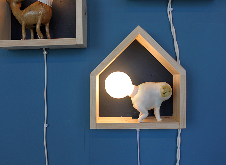
Il Sung Na
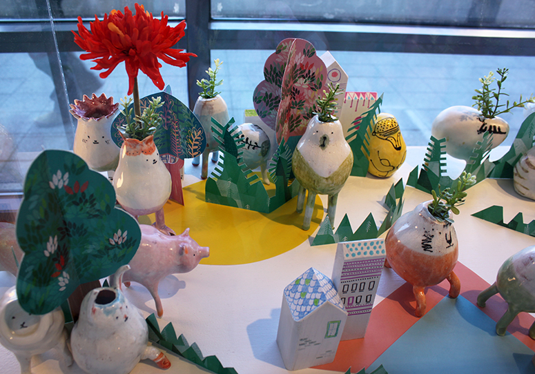
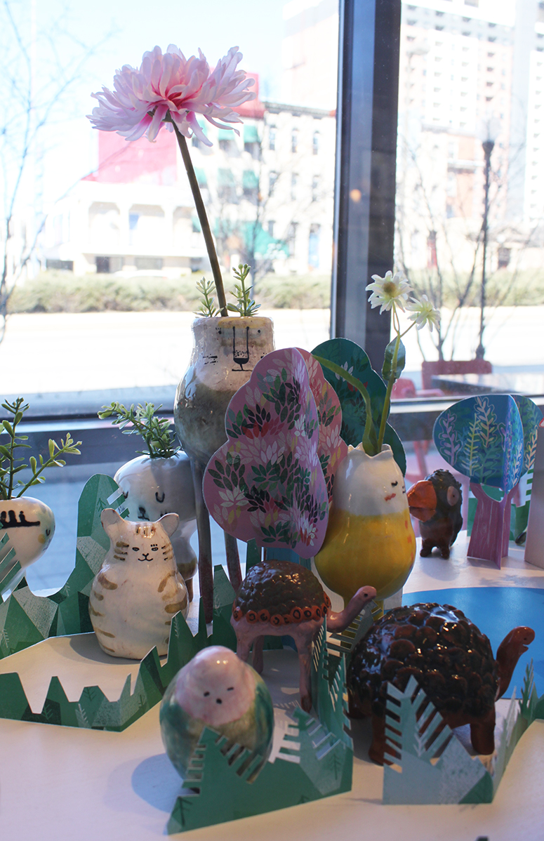
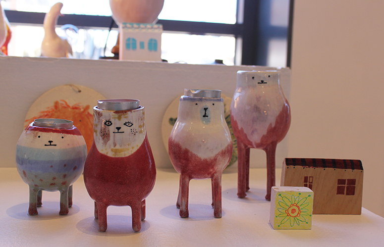
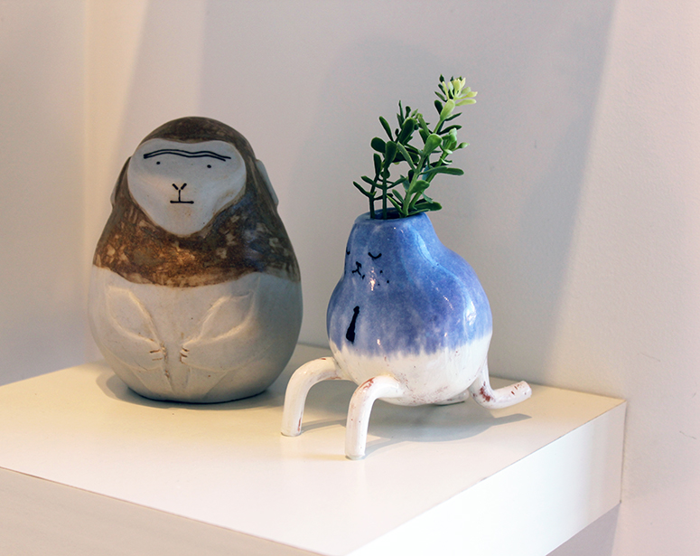
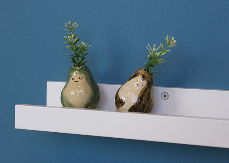
I’ve had my eye on Il Sung Na’s work since the end of 2014. I bought one of his adorable ceramic creatures at MICA’s Art Market and totally want more of ’em. He had a bunch of throughout his space, and I wish he had them for sale at the opening!
Catherine Ho
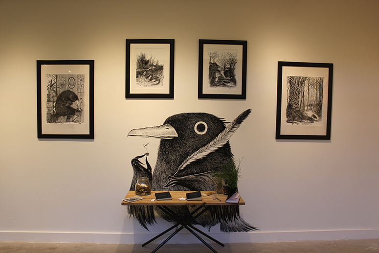
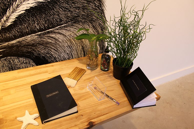
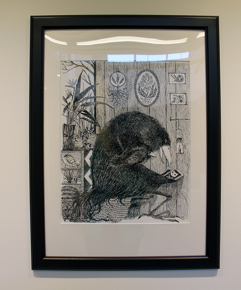
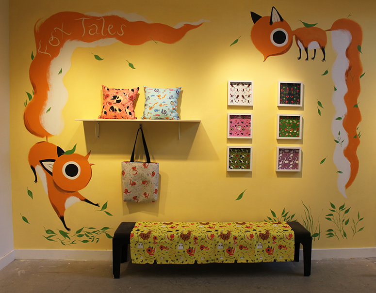
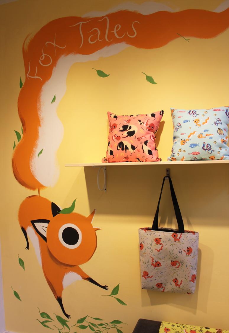
When you walk down the stairs and into the Leidy Gallery, you’re immediately greeted by Catherine Ho’s gorgeous illustrations. They occupied two walls, and each one had a different feel. The bird features small, intricate lines that are reminiscent of an etching. An adjacent wall is home to the bold stylings of Fox Tales. These fun patterns include bright colors and adorable critters.
Sarah Schneider
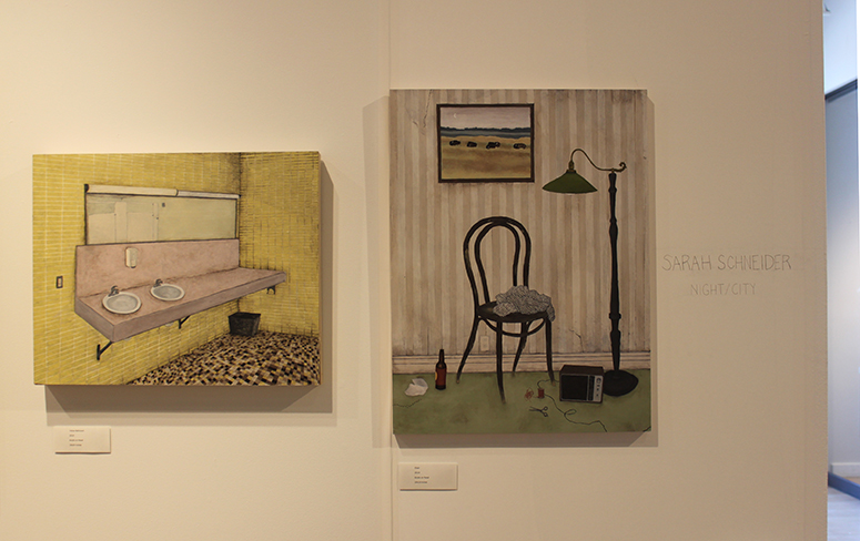
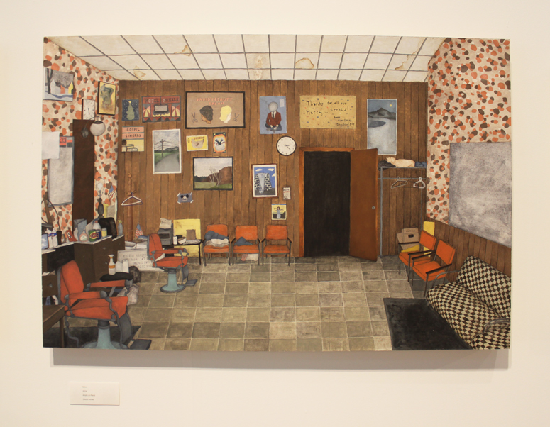
I always enjoy a well-crafted interior scene, and Sarah Schneider’s paintings depict intriguing places. Devoid of people, these slightly-dingy rooms give us clues to the type of people who frequent them. I can’t help but wonder, though, what’s the story behind the overturned amp and empty beer bottles (as seen in the painting above).
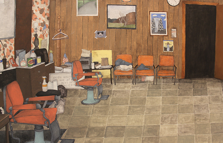
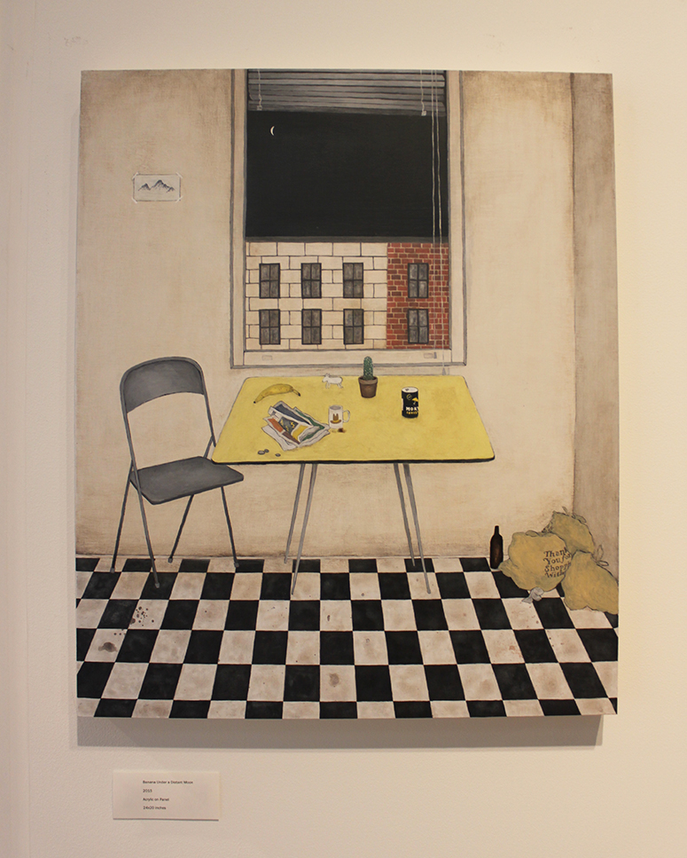
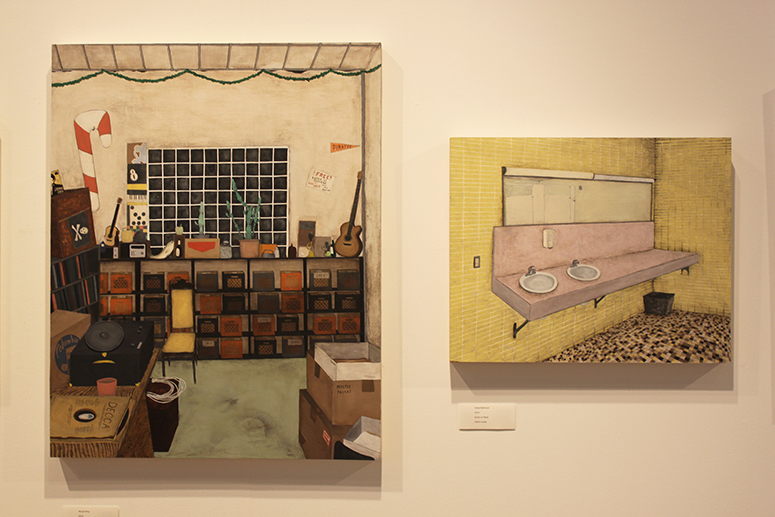
Jasu Hu
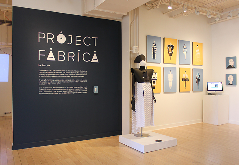
Jasu Hu’s Project Fabrica combines both of her interests — fashion and modern architecture. The illustrator created images of beautiful, angular garments that corresponded to a specific building. Plus, she built a paper mannequin!
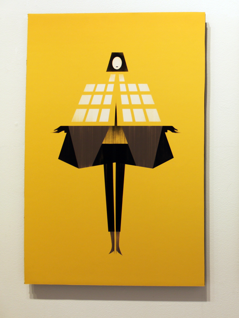
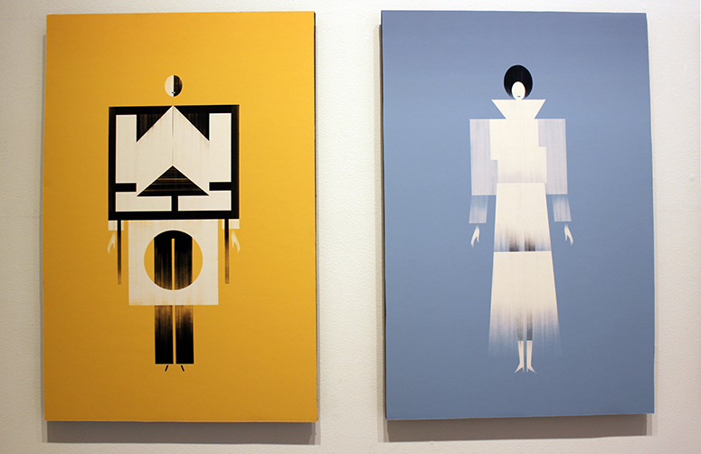
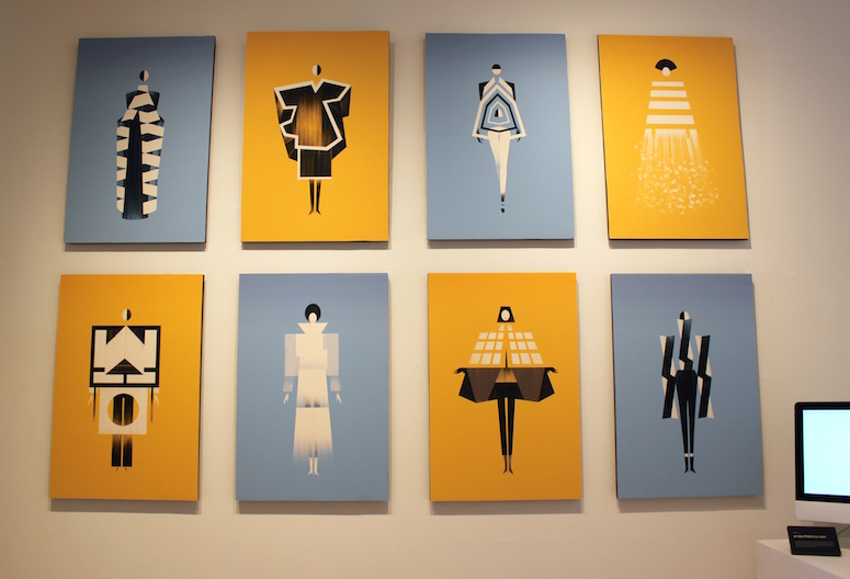
Diana Flores Blazquez
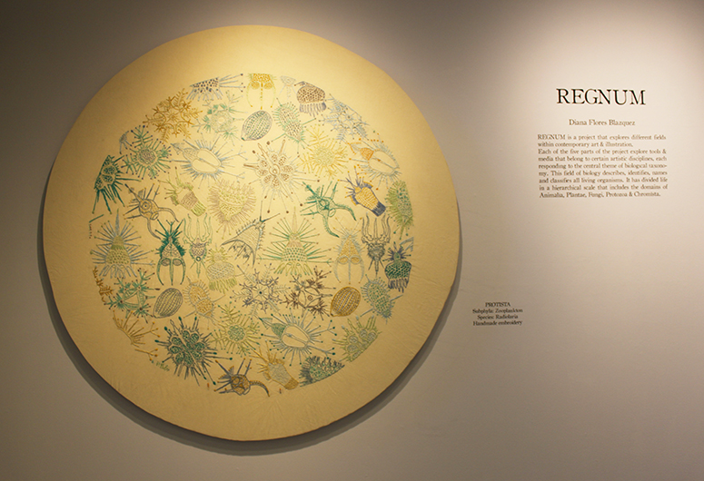
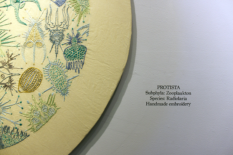
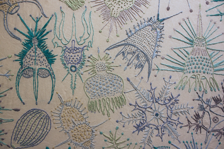
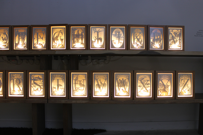
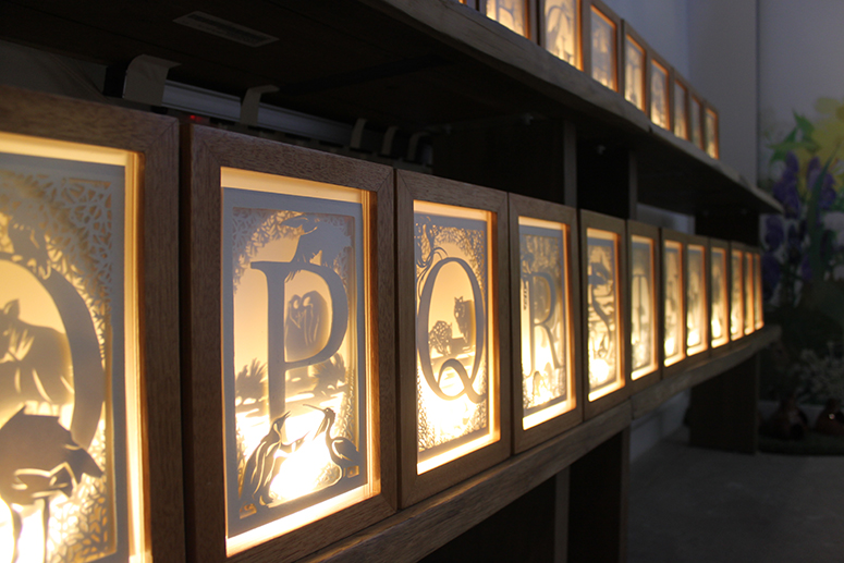
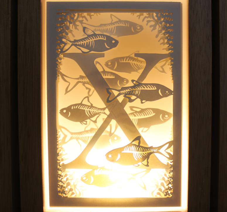
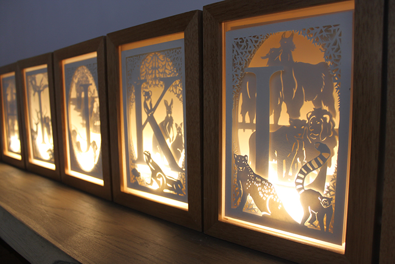
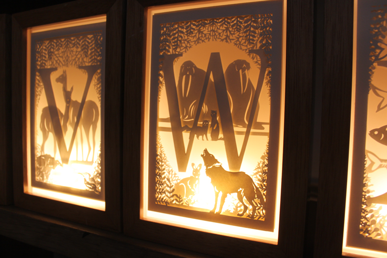
If you’ve read this blog for a while, you know that I love embroidery and 3D paper cutting/sculpture. Diana Flores Blazquez had many forms of illustration in her exhibition, but the stitching and cutouts were my favorites. She created a body of work under the umbrella of Regnum, which was a way to combine the seemingly disparate disciplines. The central theme is biological taxonomy.
The work above was a giant embroidery featuring microorganisms. In case you were wondering, this completely hand stitched! And likewise, Diana’s paper-cut animal alphabet was also created by hand. Really impressive.
Izzy & Ferd
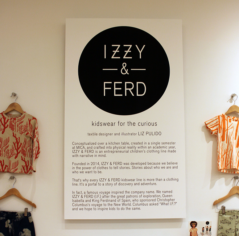
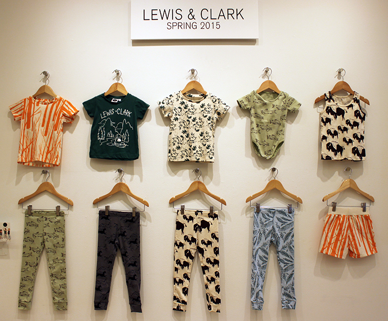
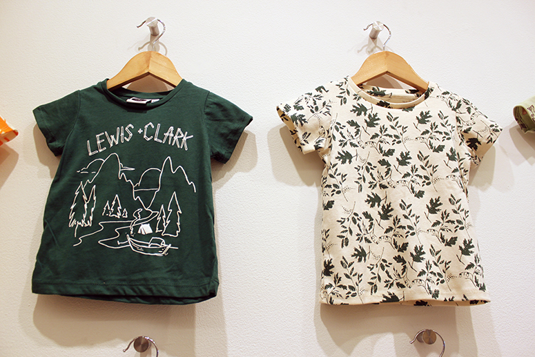
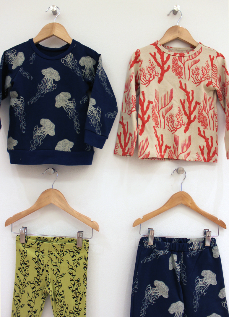
I’m not a baby/toddler/kid person (I’ve never even held a baby in my arms!), but I absolutely adored this kidswear clothing line called Izzy & Ferd. The charming designs were created by Liz Pulido (who has additional work in the show), and the clothing is inspired by discovery and adventure. Lewis & Clark is the theme of their Spring 2015 line.
Laurent Hrybyk
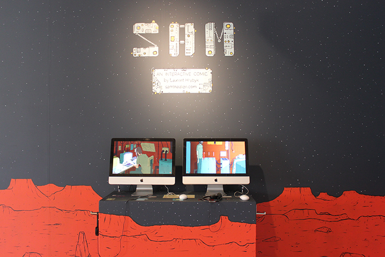
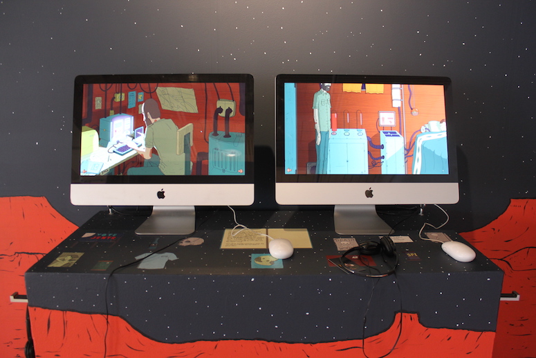
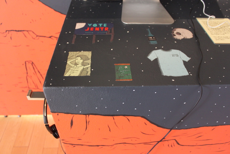
I went to the exhibition twice, and both times I trouble capturing Laurent Hrybyk’s work; there was always someone playing with it! Laurent created Sam, an interactive comic about an alien on the run. You wear headphones and click around the comic to advance the story. There are in-game puzzles and animations, too! I like this digital take on a comic and also how Laurent designed his exhibition space. He really transformed it into a different world.
