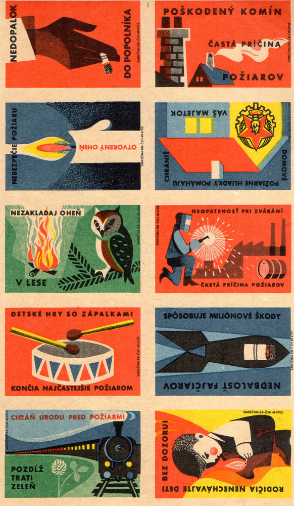
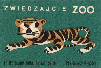
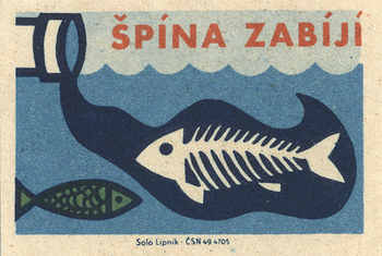
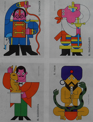
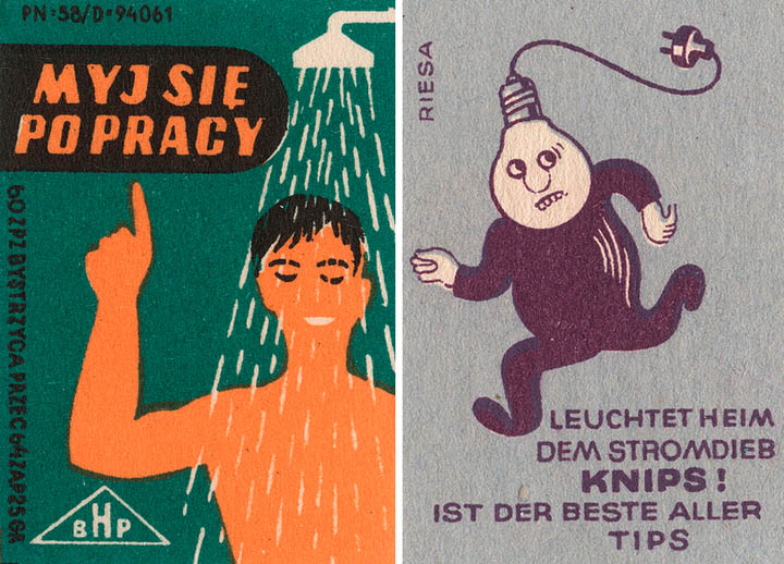
Image via Pickadolla.
Chances are that if you are a small, illustrated product from the middle of the 20th century, I probably love you. Recently, I have covered postage stamps and scout badges, all existing from a time coined “mid century modern.” Today I’m featuring vintage matchbook covers.
I’ve used the term mid century modern before, but haven’t bothered to really describe it. For your reference: It is a blanket term used to describe a number of creative endeavors from the years 1933 — 1965. This includes architecture, graphic design, and industrial design.
A lot of the illustration and products from this period of time look diffused in both color and image quality. This happened because offset lithography printing (which is used in printing newspapers, magazines, etc.) was often printed onto paper with a high-rag content. Rag paper uses cotton rags (hence the name) as its material source, so printing on it gives the appearance of being on fabric.
Well! That was a lot explanation about the context surrounding vintage matchbook covers. Hopefully you enjoy these bold designs from throughout the world. If you watch a lot of Mad Men, you probably see how much people from this era enjoyed smoking, so it’s no wonder why these are so engaging.
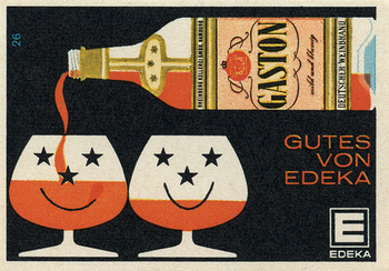
3 images above via Found in Mom’s Basement.
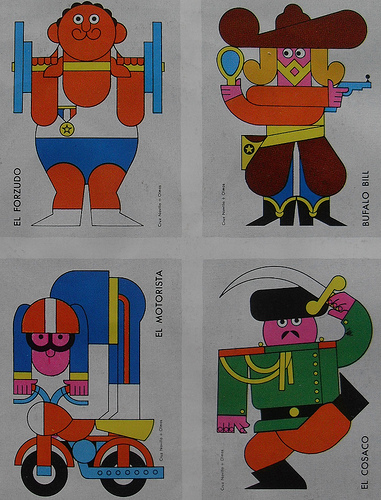
2 above images via Christian Montone’s Flickr.
By Saul Bass! Image via design:related.
2 images above via Dark Roasted Blend.

