I recently discovered Flamingo Magazine, an illustration publication based in London. They have a physical magazine as well as a blog, which is how I discovered the work of Charlotte Trounce.
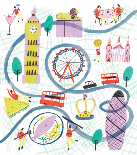
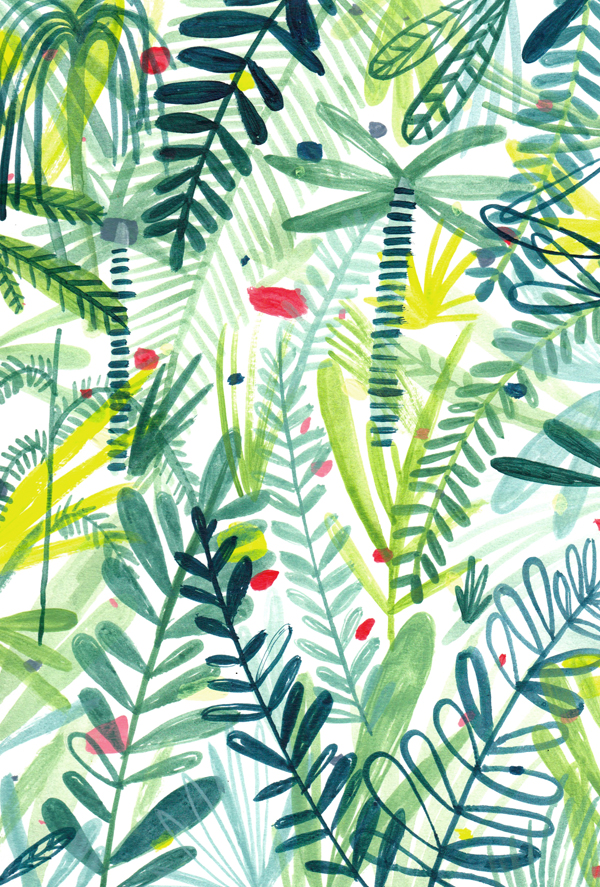
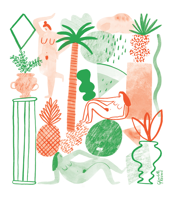
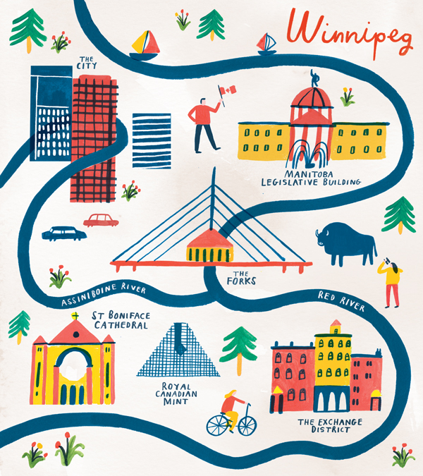
There is a big focus on shape and stroke in Charlotte’s work. Her strokes are light and lines are inconsistent, which gives her stylized shapes depth. Their symbolization starts to bring them into the world of icons, which especially works well in her map making!
All images via her website.


